
SCROLL TO EXPLORE
Advancing human happiness for our collective good.
Lead Designer
Lead Designer
Jan 2022 - Sep 2024
2022 - 2024
Matter was founded in 2019 by biochemist & neuroscientist Axel Bouchon along with cofounders Ben Goldhirsh & Chris Shiflett.
Partnering with scientists from Maastricht University, the Happiness Research Institute, and the Icahn School of Medicine at Mount Sinai, Matter seeks to find a universal biomarker for happiness to guide all of us to longer, happier, and healthier lives.
Matter’s first consumer product is an iOS app that helps people track their positive emotions, connect them to brain activity, and take actions to increase subjective well-being.
Responsibilty
- Lead Designer
- Micro-interactions
- Behavioral research
- Colour theory
- System consistency
- User testing
- Pitch decks
- Process
- Lead Designer
- Micro-interactions
- Behavioral research
- Colour theory
- System consistency
- User testing
- Pitch decks
- Process
Contribution
I joined the team during the early development (pre-testflight alpha) and played a key role in shaping Matter's iOS app, brand, and social media over the span of nearly two years.
When I joined the project, the MVP was little more than a framework, a promising foundation, but lacking soul. I saw an opportunity not just to design screens, but to craft an experience that could educate, delight, and feel genuinely human.
I took an active role in every part of the product’s evolution, working side-by-side with other designers, engineers, the CEO, and stakeholders. Together, we defined product requirements, brought structure through agile practices, and built momentum through tight feedback loops and fast iteration.
Tools
- Figma
- Lottie
- Principle
- After Effects
- Adobe Illustrator
- Adobe Photoshop
- Framer
- Figma
- Lottie
- Principle
- After Effects
- Adobe Illustrator
- Adobe Photoshop
- Framer
Alone we can do so little; together we can do so much.
30%
Product definition
Product definition made up about 20% of my time and was a key part of setting things up right. I worked closely with product managers and engineers to understand the problem space and figure out what we were really trying to solve. We dug into user needs, looked at business goals, and made sure we were all aligned before anything got designed. I helped shape early concepts through whiteboarding sessions, rough sketches, and lots of questions. Sometimes that meant pushing back to slow things down so we could focus on the right problems. Other times it was about simplifying an idea so it was easier to test or ship. It was all about getting on the same page early so we could move faster later!
Product definition made up about 20% of my time and was a key part of setting things up right. I worked closely with product managers and engineers to understand the problem space and figure out what we were really trying to solve. We dug into user needs, looked at business goals, and made sure we were all aligned before anything got designed. I helped shape early concepts through whiteboarding sessions, rough sketches, and lots of questions. Sometimes that meant pushing back to slow things down so we could focus on the right problems. Other times it was about simplifying an idea so it was easier to test or ship. It was all about getting on the same page early so we could move faster later!
20%
Collaboration & Mentoring
Collaboration and mentoring were a big part of how I worked day-to-day. I spent a lot of time with other designers, jumping into feedback sessions, pairing up on tricky problems, and sharing ideas to help push the work forward. I also spent time mentoring junior designers, helping them think through their work, giving feedback, or just being someone they could bounce ideas off when they were stuck.
It was one of the reasons I loved working at Matter, the team we built was really supportive and made working that more fun!
50%
On the tools
Most of my day was spent hands-on in the tools. Turning rough notes and early thinking into wireframes, flows, and prototypes. I worked through all the details, making sure interactions felt intuitive and layouts held up across different scenarios. I kept the design system in shape, updated components as needed, and made sure things stayed consistent without feeling rigid. I often dropped into quick chats with engineers to walk through edge cases, check technical feasibility, or tweak things based on feedback. W’d run lightweight user tests or jump into calls to observe how people interacted with the work.
Most of my day was spent hands-on in the tools. Turning rough notes and early thinking into wireframes, flows, and prototypes. I worked through all the details, making sure interactions felt intuitive and layouts held up across different scenarios. I kept the design system in shape, updated components as needed, and made sure things stayed consistent without feeling rigid. I often dropped into quick chats with engineers to walk through edge cases, check technical feasibility, or tweak things based on feedback. W’d run lightweight user tests or jump into calls to observe how people interacted with the work.
Process
I joined the team at a really exciting juncture. What began as a small group of six had grown to over 35 people almost overnight. With that kind of rapid expansion, there wasn’t much in the way of formal process yet. Drawing on my experience as a director at 3Advance where I implemented and helped ran process, I teamed up with a few others to shape a workflow that could grow with us, refining it as we went.
The result was a streamlined process that made it much easier for new designers and Product Managers to get up to speed and start contributing right away.
+50%
In development speed (est)
In development speed (est)
+20%
Growth in efficency (est)
Growth product definition (est)
Growth in efficency (est)
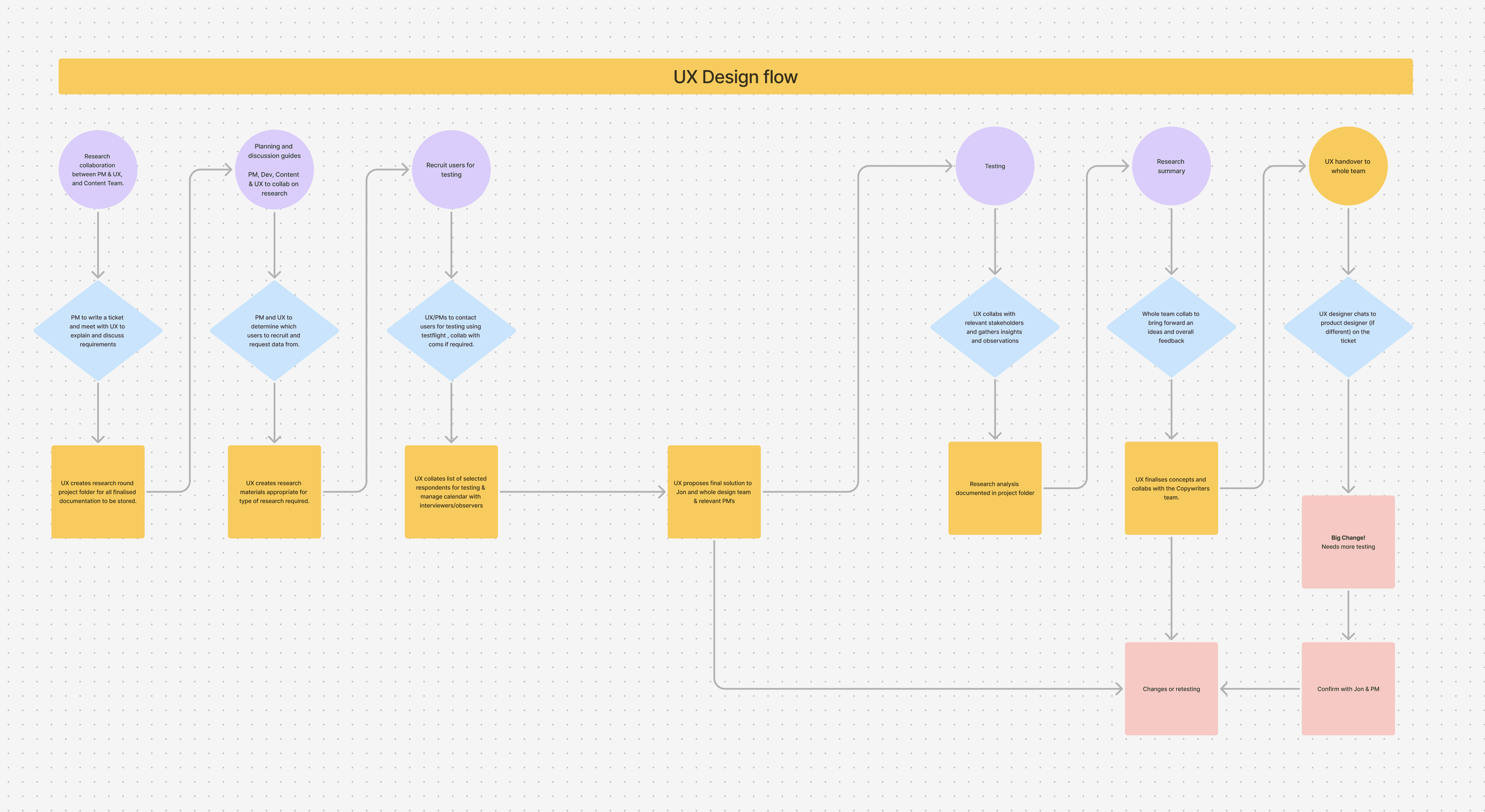
High Level UX workflow
Our UX resources were stretched pretty thin, so we put a clear workflow in place to keep things moving smoothly. Since it was a startup, not every project had the time for deep research. I worked closely with the Product Managers to figure out what each project needed and helped shape the UX from there.

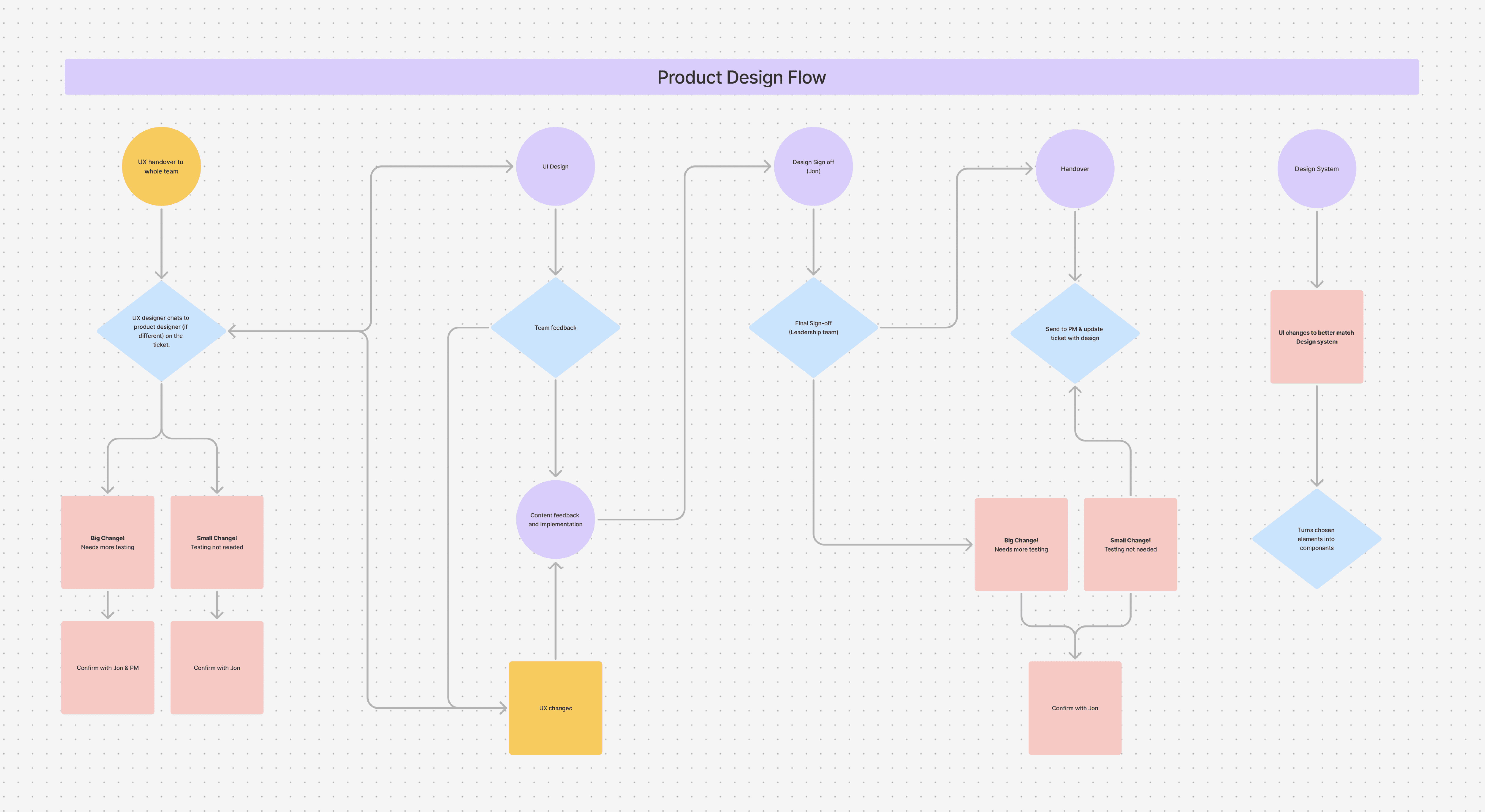
Product design flow
Since stakeholders were heavily invested in this phase, a workflow was created to ensure stakeholders could accompany us on our journey and in order to avoid last minute changes. As a design team we collectively assumed a bird’s eye view of all the projects, and paid particular attention to the high priority projects requiring stakeholder collaboration to make a faster sign-off possible.

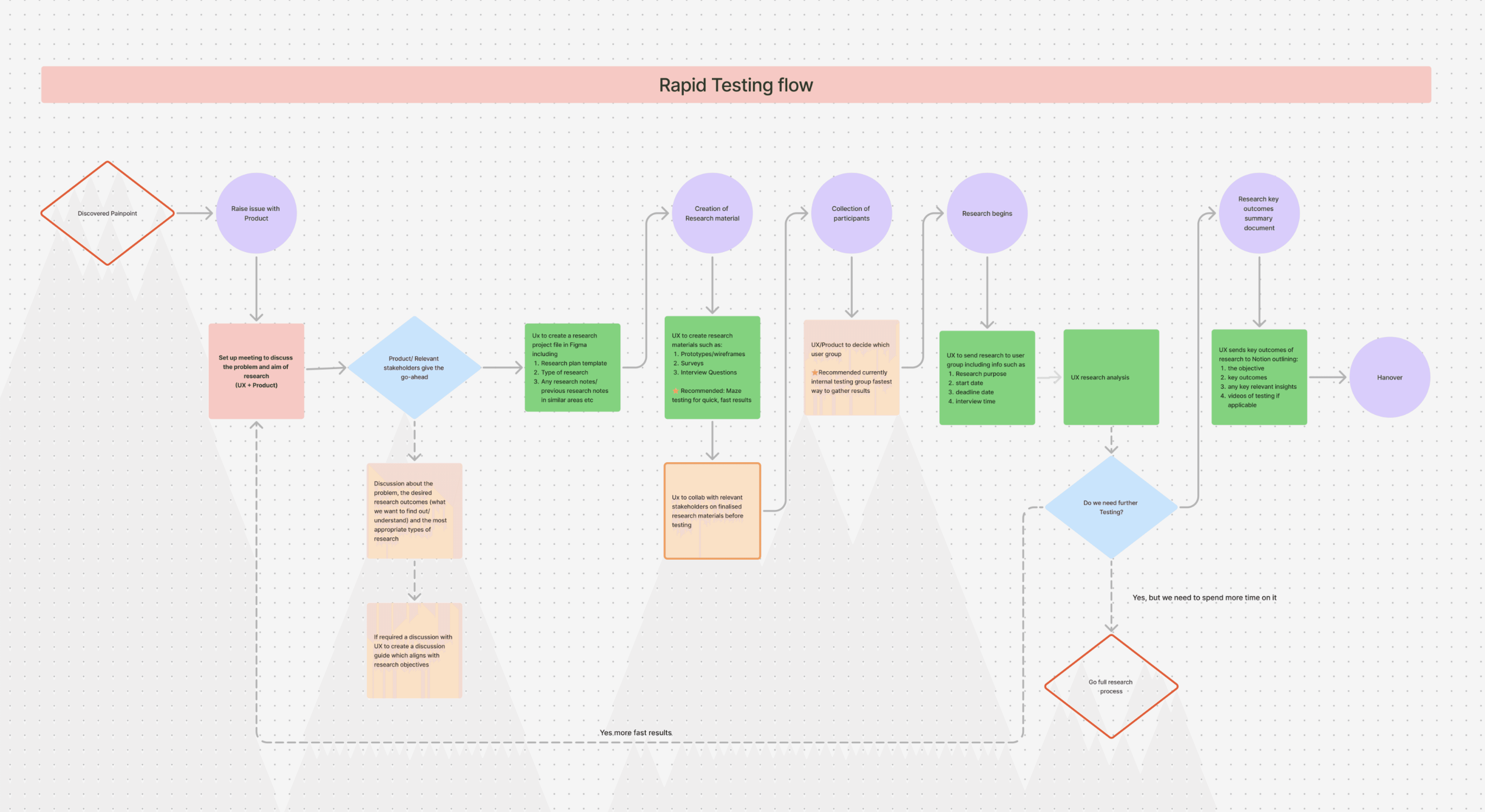
Rapid testing flow
Not every project received the same treatment. For larger projects, we opted for 5-10 user interviews followed by low fidelity Maze testing. For projects with smaller resources, we implemented a rapid testing workflow that allowed anyone from the product team to validate ideas quickly with Maze.
High Level UX workflow
Our UX resources were stretched pretty thin, so we put a clear workflow in place to keep things moving smoothly. Since it was a startup, not every project had the time for deep research. I worked closely with the Product Managers to figure out what each project needed and helped shape the UX from there.
Product design flow
Since stakeholders were heavily invested in this phase, a workflow was created to ensure stakeholders could accompany us on our journey and in order to avoid last minute changes. As a design team we collectively assumed a bird’s eye view of all the projects, and paid particular attention to the high priority projects requiring stakeholder collaboration to make a faster sign-off possible.
Rapid testing flow
Not every project received the same treatment. For larger projects, we opted for 5-10 user interviews followed by low fidelity Maze testing. For projects with smaller resources, we implemented a rapid testing workflow that allowed anyone from the product team to validate ideas quickly with Maze.
High Level UX workflow
Our UX resources were stretched pretty thin, so we put a clear workflow in place to keep things moving smoothly. Since it was a startup, not every project had the time for deep research. I worked closely with the Product Managers to figure out what each project needed and helped shape the UX from there.
Product design workflow
Since stakeholders were heavily invested in this phase, a workflow was created to ensure stakeholders could accompany us on our journey and in order to avoid last minute changes. As a design team we collectively assumed a bird’s eye view of all the projects, and paid particular attention to the high priority projects requiring stakeholder collaboration to make a faster sign-off possible.
Rapid testing workflow
Not every project received the same treatment. For larger projects, we opted for 5-10 user interviews followed by low fidelity Maze testing. For projects with smaller resources, we implemented a rapid testing workflow that allowed anyone from the product team to validate ideas quickly with Maze.
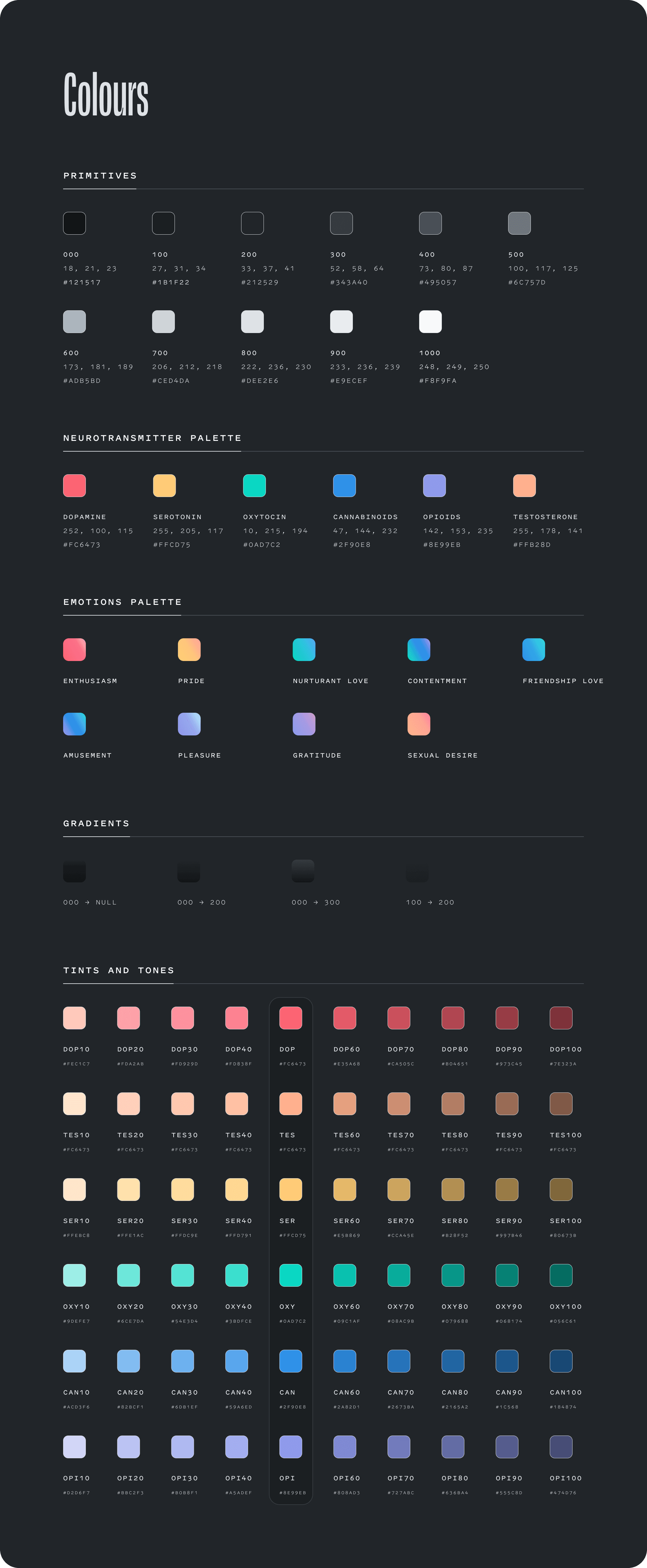
Branding
Matter brought me in for my expertise in colour and colour theory. At the time, the team had not yet explored colour in the product. They were cautious about introducing it and needed a system that fit their existing brand. It also had to feel intuitive, emotionally engaging, and grounded in scientific accuracy.
This was not a typical rebrand or visual refresh. The goal was not to simplify or reduce. Every colour had to serve a purpose. It could only be used to represent specific neurotransmitters and emotional states.
Each choice needed to be backed by research.
I created a colour system that became a central part of the product’s identity. It helped users connect with the experience in a more emotional way.
It also made complex scientific ideas easier to understand. The system gave the team a clear structure to work with. It supported future decisions without compromising the science behind the product.
Designing a Colour System for Emotion.
To understand the challenge, it helps to look at how the Matter protocol works.
It’s built around six core neurotransmitters, which combine in different ways to form nine key emotions.
Our goal was to help users learn how their activities and behaviors could activate these neurotransmitters, and understand how to mix and engage with them in a meaningful, science-backed way.
The final colour system in all her glory
While I won’t go into the full nuance of how we arrived at the final colour system here, the process was rooted in colour theory, pyscology, accessibility, and emotional clarity.
Each tone and saturation carefully calibrated for contrast, emotion, and usability. I also reworked the foundational primitives (tints and tones) to provide the right visual balance and allow the new palette to stand out with clarity and vibrancy.
While I won’t go into the full nuance of how we arrived at the final colour system here, the process was rooted in colour theory, pyscology, accessibility, and emotional clarity.
Each tone and saturation carefully calibrated for contrast, emotion, and usability. I also reworked the foundational primitives (blacks and tones) to provide the right visual balance and allow the new palette to stand out with clarity and vibrancy.
Accessibility was a key part of this process. I tested combinations across light and dark modes, optimizing for legibility and contrast ratios to meet WCAG standards, without compromising on the aesthetics.
The result is a palette that feels alive, readable, and inclusive!
Accessibility was a key part of this process. I tested combinations across light and dark modes, optimizing for legibility and contrast ratios to meet WCAG standards, without compromising on the aesthetics.
The result is a palette that feels alive, readable, and inclusive!
Design System
Introducing our new design system wasn’t your typical rollout. It was conceived, planned, and implemented during a major codebase migration and an upcoming app release, neither of which had originally accounted for the new design system.
We worked closely with the product team to align timelines and deliver everything on schedule, despite the tight constraints.
The payoff was well worth it. Developers now ship features in half the time, new team members onboard faster with clear guidelines, and designers can prototype quickly without starting from scratch.
+50%
In development speed (est)
+70%
In design speed (est)
Design System
Introducing our new design system wasn’t your typical rollout. It was conceived, planned, and implemented during a major codebase migration and an upcoming app release, neither of which had originally accounted for the new design system.
We worked closely with the product team to align timelines and deliver everything on schedule, despite the tight constraints.
The payoff was well worth it. Developers now ship features in half the time, new team members onboard faster with clear guidelines, and designers can prototype quickly without starting from scratch.
+50%
In development speed (est)
+70%
In design speed (est)
Projects
Given the environment of a fast-paced startup, my time at Matter involved a variety of large-scale projects spanning smartphone applications, desktop, and social media.
Given the environment of a fast-paced startup, my time at Matter involved a variety of large-scale projects spanning smartphone applications, desktop, and social media.

Rating System
Translating emotion into a science-backed rating system.
My first proper task was to design the emotional rating flow of memories. Our goal wasn’t efficiency, it was resonance. We wanted users to pause, process, and meaningfully connect with what they felt.
Recalling the memory is what activates the neurotransmitters and makes you happy, so kinda important!
When I began rethinking the emotional rating experience, my first design decision after research was to create a wheel-based interaction.
We wanted users to move away from tapping or swiping through emotions quickly, and instead feel anchored in a slower, more reflective process. More effort to rate 8, makes it feel more important - you really need to earn it. We added optics and animation to make the experience more joyfull. Lets get users to a 8 memory - to activly go out and find them!
KPI: Achieve 98% task success rate in usability tests
KPI: Achieve 98% task success rate in usability tests
98%
Users tested, understood the assignment
Of users tested, understood the assignment!
+20%
Growth in completion of a memory
Your Brain
Understanding Happiness
After building the emotional rating flow, my next objective was helping users understand emotions, and what’s happening in the brain when we feel them.
We wanted a way to surface neuroscience in a visual, intuitive, and emotionally intelligent format.
After building the emotional rating flow, my next objective was helping users understand emotions, and what’s happening in the brain when we feel them.
We wanted a way to surface neuroscience in a visual, intuitive, and emotionally intelligent format.
I designed a human brain map that visually highlighted the key regions linked to eight distinct positive emotions. The goal was to help users form a clearer mental model of how different emotional states connect to specific areas of the brain.
Each visual was grounded in verified fMRI neurofeedback scans, sourced directly from our in-house scientific studies. This ensured the designs were not only engaging, but also rooted in real biological data. It became a central piece of the experience, helping users connect more deeply with the science behind the product.
I designed a human brain map that visually highlighted key brain regions associated with the 8 distinct positive emotions.
Each visualization was grounded in verified fMRI neurofeedback scans sourced directly from our scientific studies, ensuring the visuals were not only beautiful, but biologically accurate.
In an ideal world these would of been built in 3D we didn't have long enough for dev to implement this, time was of the essence, so we did a quick and dirty something something.
It was tricky to make sure they were scientifically correct on the ranges that we set forth (1-8) and also include that over time they would increase in your brain something something.
We originally wanted these built in 3D to bring more depth and realism to the experience. But with tight timelines and limited dev resources, we had to move fast and find a simpler way to bring the idea to life.
The visuals still needed to be grounded in science. Each neurotransmitter had to stay within a specific range of 1 to 8. We also had to show how these levels could gradually increase over time in the brain. It was a balance between speed, clarity, and scientific accuracy.
These modals served a dual purpose: they helped users understand the science behind their emotional experiences, while also nudging them to add more memories. The more memories added, the more personalized the algorithm became.
Adding memories
Turning memories into neural pathways
My next objective was to redesign adding memories. We needed to streamline the process, add content types and make it easier to edit.
We also wanted to give the user a sense of completion at the end of adding a memory and to better understand how that memory had increased your neuroplasticity.
My next objective was to redesign adding memories. We needed to streamline the process, add content types and make it easier to edit.
We also wanted to give the user a sense of completion at the end of adding a memory and to better understand how that memory had increased your neuroplasticity.
Issue 1
From some early user testing, we noticed that a staggering 61% of people were dropping off before finishing adding their memories. It was clear we needed a quicker, simpler way to capture memories, along with a bit of education on why it actually matters to keep doing it. We also added the option to save drafts, so if someone did drop off halfway through, they would get a gentle reminder to come back and finish it later. Small tweaks like this made the whole process feel much less like a chore.
KPI: 30% increase in completing a memory
Issue 2
From user interviews, we learned that many users wanted the option to add text-based memories. It turned out to be more important than we’d originally expected.
The good news was the back-end work was already done, so all we needed was a simple, user-friendly way to slot it in. A quick win that made a real difference.
KPI: Have text based memories by Q3
KPI: Have text based memories by Q3
Issue 2
From user interviews, we learned that many users wanted the option to add text-based memories. It turned out to be more important than we’d originally expected.
The good news was the back-end work was already done, so all we needed was a simple, user-friendly way to slot it in. A quick win that made a real difference.
KPI: Increase 30-day recall from 40% to 50% by Q4
We gave users the abilty to filter and sort there memories, based on Neurotransmitter, emotion, music, people, and type, along with seeing all their memories
We gave users the abilty to filter and sort there memories, based on Neurotransmitter, emotion, music, people, and type, along with seeing all their memories
Recalling memories
The secret sauce to happiness
What really makes the Matter protocol effective is the process of recall. It isn’t enough to simply add memories and revisit them occasionally.
True benefit comes from deliberately reflecting on these memories and ensuring that this reflection activates a broad range of neurotransmitters.
What really makes the Matter protocol effective is the process of recall. It isn’t enough to simply add memories and revisit them occasionally.
True benefit comes from deliberately reflecting on these memories and ensuring that this reflection activates a broad range of neurotransmitters.
KPI: Increase 30-day recall from 40% to 50% by Q4
KPI: Increase 30-day recall from 40% to 50% by Q4

The app knows which neurotransmitters are activated for which memories, and which neurotransmitters you might be missing, so it can resurface the memories you need most.
The app knows which neurotransmitters are activated for which memories, and which neurotransmitters you might be missing, so it can resurface the memories you need most.
The one tricky neurotransmitter & emotion.
Let's talk about sex…
One of the more sensitive challenges we faced was how to capture memories related to sexual desire.
Although our scientific research showed this was a key contributor to happiness and a core element of the Matter Protocol, users were hesitant to engage with it. The emotional vulnerability required was noticeably higher than in other areas of the app.
To address this, we made several intentional product decisions. We softened the language, focusing on emotional context rather than explicit terms. The prompt was made optional, introduced later in the journey after trust was established.
We also reassured users through clear privacy messaging, reminding them that this content was fully private and for their eyes only. In the future, we planned to allow users to tag these memories using custom or less direct labels, giving them more agency and comfort.
These subtle choices helped lower the barrier without compromising user trust.
KPI: 50% increase in logging a Sexual Desire Memory
KPI: 50% increase in logging a Sexual Desire Memory
Some nice words to end things off.

Axel Bouchon
Neuroscientist, CEO & Founder, Matter Neuroscience
As CEO of Matter Neuroscience, I worked with Chloe while she was the digital lead designer. The task at hand was particularly challenging as she had to develop a design system for an app that was standing on very shaky scientific and technical ground at the time and define the core output of the app for the user. This continuously changing environment was further enhanced by several different opinions in the leadership around her.
The professionality, excellence, speed and the positive attitude she approached the task with remains a clear highlight to me in my career working with designers.
As CEO of Matter Neuroscience, I worked with Chloë while she was the digital lead designer. The task at hand was particularly challenging as she had to develop a design system for an app that was standing on very shaky scientific and technical ground at the time and define the core output of the app for the user.
This continuously changing environment was further enhanced by several different opinions in the leadership around her.
The professionality, excellence, speed and the positive attitude she approached the task with remains a clear highlight to me in my career working with designers.
Years later, her color panel and design system is still the center of the digital consumer product of Matter.
(In Axels words as a German native speaker "I also didn't clean it up with any LLM, so it's pure German English :))
As CEO of Matter Neuroscience, I worked with Chloe while she was the digital lead designer. The task at hand was particularly challenging as she had to develop a design system for an app that was standing on very shaky scientific and technical ground at the time and define the core output of the app for the user.
This continuously changing environment was further enhanced by several different opinions in the leadership around her.
The professionality, excellence, speed and the positive attitude she approached the task with remains a clear highlight to me in my career working with designers.
Years later, her color panel and design system is still the center of the digital consumer product of Matter.
(In Axels words as a German native speaker "I also didn't clean it up with any LLM, so it's pure German English :))

Chris Shiflett
CEO & Product, Faculty
Chloë approaches design the way I wish all designers did: as a creative thinker and problem solver. There’s something about an elegant, intuitive design that just looks beautiful, and you rarely get there when chasing beauty alone.
Chloë approaches design the way I wish all designers did: as a creative thinker and problem solver. There’s something about an elegant, intuitive design that just looks beautiful, and you rarely get there when chasing beauty alone.
Jay Wilson
Senior Software Engineer, Matter Neuroscience
I worked with Chloë as an iOS developer on the Matter app. Her attention to detail in both UI and UX was exceptional, and she consistently found solutions for complex user experience challenges. She was always open to discussing how to achieve the best user experience while working within our time and framework constraints. This collaborative approach really helped us deliver features that truly served our users. I highly recommend her for any design project.
Jay
Senior Software Engineer, Matter Neuroscience
I worked with Chloë as an iOS developer on the Matter app. Her attention to detail in both UI and UX was exceptional, and she consistently found solutions for complex user experience challenges. She was always open to discussing how to achieve the best user experience while working within our time and framework constraints. This collaborative approach really helped us deliver features that truly served our users. I highly recommend her for any design project.